


ux design
Acting on an in-class prompt, the following is a hypothetical dog care brand and digital platform design. The task was to create an interface and brand exclusively with the diversity of the user’s experience as the forefront for the design process. To preface the conceptualization of the brand, a spectrum of different use archetypes were taken into account (user age bracket, animal expertise, animal type etc.). Darling Daycare was my brand of choice to tackle the prompt. A universal trait that I noted across the spectrum of archetypes was the valid sense of urgency and anxiety most users would experience in trusting their pet in the care of a business. Opting for a bright color scheme complements by softer visual elements rendered the final product welcoming and endearing which were two characteristics that I profiled would appeal to most prospective users as they prepared to be separate from their pets. One of the most distinctive components of Darling Daycare’s interface would be the Track-Your-Pet page which theoretically would enable the user to track their pet’s updated status via the software and even schedule video meetings so as to reduce potential user anxiety. The final step of the process was intriguing as it involved actually rigging the pages via Adobe XD to illustrate a realistic navigating experience.


Don't be afraid to expand your horizons!
(click to expand)
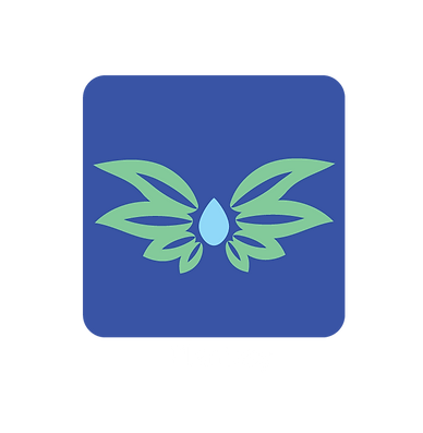
Dedicated to a similar prompt, the second half of the course involved the development of an app designed to assist users in remembering to water their plants. The ideal final product was an app that was prepared to appeal to inexperienced and experienced users across the spectrum of possibilities. After studying existing apps with a similar purpose with an array of creative and rather ingenious branding schemes, I was quite perplexed as to how I could break the mold and individualize my project. Naming the app was actually the most challenging step. Spending hours reciting plant-related terms until eventually one finds themselves slurring out entirely jumbled words is always a rewarding starting point. My jumbling session yielded “Plantasy,” derived from the escapism popularly associated with plant-care as a hobby. This fantastical quality ebbed into the logo’s design. The leaves surrounding the water droplet echo a fantastical inkling of wings representative of the serene escape plants can provide not to mention the plant’s soaring delight when the user remembers to water them. As visible by the variants below, there was a something conflict on the final visuals of the app icon. The defining reason I vied away from the inclusion of flora-based elements was rooted in the intention of the prompt. Flowers are not a defining trait for all plants and by extension the experience of all users. Although subtle, I felt this rendered the final logo more inclusive. Designing the individual pages was my favorite section of both of these projects actually. It is an exercise that allows the designer to truly experiment within the boundaries of the established brand. Abiding by rules merely serves to engage creativity further in my experience, a test of coherence for the artist. Where can the logo fit seamlessly on the page? What resonate with this brand? What creative language does the brand speak? These questions inspire me to find the answer which will always reside in the finished product.


Don't be afraid to expand your horizons!
(click to expand)